
Somebody looks at a recolored garment and says it looks fake. That is a report rather than a diagnosis, and it is usually accurate.
The eye registers physical inconsistency well before anybody can name what is wrong, which is why the comment arrives as a feeling and gets dismissed as vague. It is not vague. There are a small number of specific things that go wrong when an app to change color of clothes produces an unconvincing result, each with its own cause, and naming them converts an unusable review comment into a fixable one.
What follows is a description of the failure modes rather than a claim about how often they occur, which varies by fabric and by how the source was captured.
The eye detects before it articulates
Cloth behaves in ways people have seen since childhood without ever describing. A fold is darker, and darker in a particular way. A seam interrupts a surface. A satin catches light along a direction. Skin next to fabric picks up a little of its color and none of its texture.
None of that is knowledge anybody was taught, and all of it is knowledge the eye applies instantly. When a recolor breaks one of those expectations, the viewer notices without locating it, and reports the only thing available to them, which is that something is off.
The practical consequence is to take that comment seriously and then ask a better question. Not whether the image looks good, but which of the following is happening.
Five things that go wrong, and what causes each
| The tell | What is actually wrong | Who usually catches it |
|---|---|---|
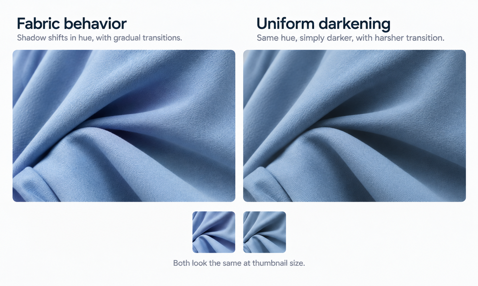
| The garment reads flat | Folds and shadows took the new color uniformly. Real cloth shifts in hue as well as brightness where light does not reach | Any reviewer, but only at full size. It looks correct in a grid |
| The fabric looks like a different fabric | The surface was flattened: pile direction, rib highlight, or sheen no longer behaves as it did | Somebody who knows the product. The hue is correct, so a general reviewer moves on |
| The edges feel wrong | Color crossed the garment boundary onto skin, hair or background, or stopped short at a seam | Any reviewer, quickly, once they know to look at boundaries |
| Something changed that should not have | Hardware, contrast topstitching, a woven label or a zip tape shifted with the body, or a self-fabric trim failed to | Somebody who knows the product, via the comparison against source |
| The color is not a color cloth does | A saturation no dyed fabric of that fiber would reach | Frequently the customer, holding the garment |
The list is short because the failures are structural rather than various. Most unconvincing recolors are one or two of these, and once somebody has seen them named they stop being hard to find.
The costs differ more than the appearances do. Two of the five are visible to any reviewer, two need somebody who knows the product, and one is generally caught by a customer holding the garment.
Shadow and fold behavior is the tell that reads first
The most common failure is a garment that has taken the new color uniformly, including in the places where light does not reach.
Real cloth in a fold is not the same color rendered darker. The shadow shifts in hue as well as value, the transition has a width that depends on the weight of the fabric, and a heavy wool folds differently from a light viscose. A recolor that darkens uniformly produces something that reads as a flat shape wearing a color rather than a garment in it.
This is also the failure most likely to survive review, because it looks correct at thumbnail size and at the size most people check. It becomes visible when the image is viewed at the size a customer views it, which is a good argument for reviewing at full size rather than in a contact sheet.
The related failure is a color the fabric could not be. Dye behaves differently on different fibers, and a saturation that no dyed cloth of that type would reach reads as artificial even to somebody who could not explain why. Judging colorway direction against what the fiber can actually take is a check worth making before a shade goes any further.
Trims, closures and stitching: what should not have changed
The second family of failures is about selectivity. A recolor is supposed to change the garment body and leave everything else alone, and the boundary between those two is where results go wrong in both directions.
Things that should not have shifted and did: metal hardware, horn or shell buttons, contrast topstitching, a woven label, a zip tape that was meant to stay tonal. Things that should have shifted and did not: self-fabric bindings, covered buttons, a self belt.
Both are found the same way. Logos, printed text, care labels, and small hardware get compared against the source image on every single on-model output, without exception, and in a recolor the comparison has an extra question attached: not only whether the element is correct, but whether it was supposed to change at all. Reconstructed detail lands almost right — a letterform slightly off, a stitch count wrong, a zipper pull the wrong shape — and a mis-shifted trim sits in the same family.
When one element is wrong and the rest of the frame is sound, a targeted correction to that region is smaller than rerunning the whole colorway and keeps the set comparable. In Lightchain AI (apparel AI) the uploaded source stays beside every AI Virtual Try-On output derived from it, which is what makes the supposed-to-change question answerable in a few seconds rather than from memory.
What no amount of fixing changes
Some of what makes a recolor unconvincing is fixable, and some of it is outside what the output can be.
Screen color is not a physical reference, exact code matching is not something to promise, and the gap between a monitor and a roll of cloth stays open regardless of display quality. Colorways get settled by strike-offs against an agreed standard. A recolor that reads convincingly on screen has produced a convincing image and not an approved shade, and the two get confused most often when the image is good.
The rest of the boundary applies unchanged. The output is a visual asset. It does not predict fit, determine sizing, model how a fabric behaves in motion, or forecast returns. Those come from measurements, a graded pattern, a physical sample, and your own data. A recolor changes the appearance of a garment and nothing about any of that.
Two scope answers save time. Footwear is not covered by this class of workflow, and that is structural rather than a gap waiting to close. Lace and open work, sheer fabrics, complex prints, and heavily layered looks are documented weak spots, and a recolor in those categories inherits the category verdict. In those cases the result may be unconvincing for reasons that no amount of reviewing will resolve, and the answer is photography rather than another attempt.
How to review for these without slowing down
The five tells can be checked faster than they can be described, once the order is fixed.
-
Look at a fold first, at full size, and ask whether the shadow shifted in hue rather than only in brightness
-
Look at the surface next: does the texture still show direction, does the sheen still fall where it did
-
Then the boundary: does the color stop where the garment stops, and does it survive a seam without bleeding
-
Then the elements: which things changed that should not have, and which did not change that should have
-
Last, the shade itself: could a dyed cloth of that fiber reach this saturation
Reviewing in that order matters because the hue is what the eye goes to unprompted, and putting it last is what stops it absorbing the whole review. The first four questions take a few seconds each and catch the failures that a hue-first review misses entirely.
Whether the work runs through Lightchain AI or a camera, and across a catalog of any size, this is a review order rather than an additional review, which is the only version of it that survives a busy week.
Frequently asked questions
Our reviewer keeps saying it looks off but cannot say why. Is that useful?
Very, and it should be treated as a detection rather than an opinion. Ask them to check the five tells in order, since the report is usually accurate and the location is what they lack. A reviewer who says nothing is the one to worry about.
Which failure is most common?
Uniform darkening in folds is the one that appears most often and survives review most easily, because it looks correct at small sizes. It becomes visible at the size a customer sees. That is the argument for reviewing at full size rather than in a grid.
Why do trims sometimes change when they should not?
The boundary between garment body and everything attached to it is not obvious from an image alone, so elements adjacent to the body can be treated as part of it. The comparison against the source is what catches it, and the extra question to ask is whether the element was supposed to change at all.
Can a bad recolor be fixed, or should we rerun?
If one region is wrong and the rest is sound, a targeted correction is smaller and keeps the colorway set comparable. If the fold behavior is wrong across the garment, that is not a regional problem and rerunning or reshooting is the honest answer. Judge by whether the failure is local.
Does a better source photograph help with this?
With most of the tells, yes, since a neutral, evenly lit, complete capture gives more to work from at the boundaries and in the folds. It does not help with the shade question, which is settled physically regardless of the source. Capture quality moves several of these and none of the color limit.
Are some fabrics simply not worth attempting?
Lace and open work, sheer fabrics, complex prints, and heavily layered looks are documented weak spots, and a recolor in those categories carries the same verdict. Route them to photography and record the reason rather than iterating. Attempts in a category that will not hold are the most expensive form of review.
In closing
Looks fake is an accurate report of a specific problem the viewer cannot locate. Five things cause it: uniform shadow, flattened surface, color that crosses the garment boundary, elements that changed when they should not have, and a shade no dyed cloth of that fiber would reach. Each is checkable in seconds once named, and reviewing them in order matters because the hue absorbs attention if it goes first. What none of it produces is an approved color, which stays a physical decision settled against a standard.
Start here
Take the last recolor somebody described as looking off and go through the five tells in order on that specific image. Most people find it in the first two and are surprised it was namable. Then keep the order as the review sequence rather than as a troubleshooting exercise, since checking a fold before checking a hue costs nothing and is the difference between catching these and not.
**Start with fabric and colorway work → **https://www.lightchainai.com/global/solutions/designWithPurpose