
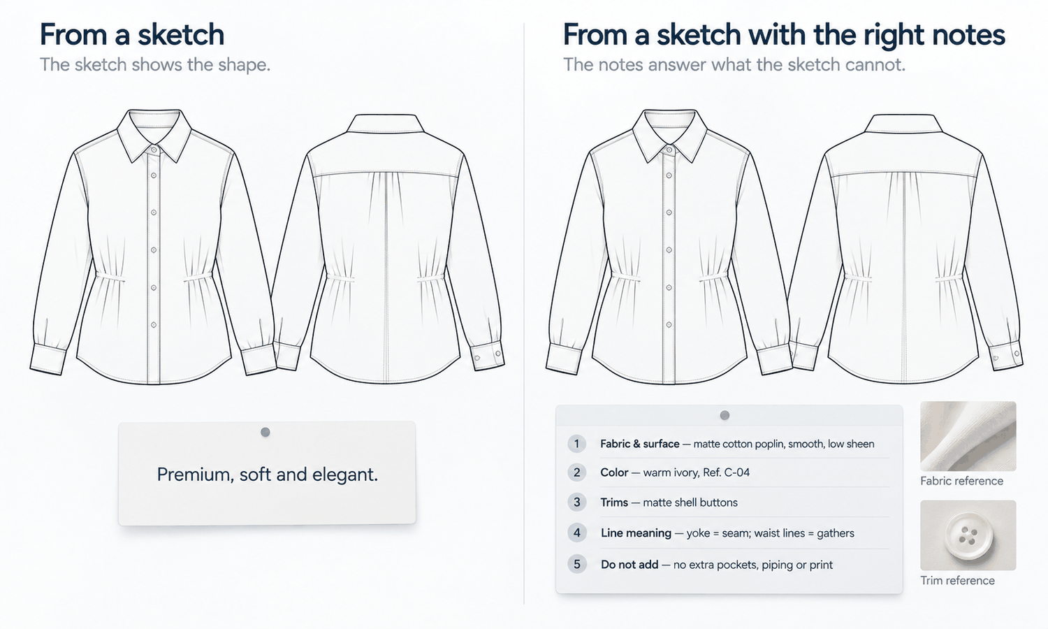
A sketch into photo conversion depends as much on the words that go with the sketch as on the lines themselves. The sketch fixes the structure: the silhouette, the seams, where the pockets and closures sit. Everything else, including the fabric, its surface, the color, the trims and what the back looks like, comes from whatever else the conversion is given. If it is given nothing, it fills those things in with whatever is most plausible. If it is given a few clear words and the right references, it has far less to invent.
Most teams put their effort into the drawing and very little into the note beside it. A line like "make it look premium" or "soft and elegant" is common, and it is exactly the kind of instruction that produces an attractive image of a garment nobody designed.
This article explains why the words matter, what to write, what not to write, how instructions look for common categories and how to handle the result once it comes back.
| What to describe | Weak instruction | Useful instruction |
|---|---|---|
| Fabric | "Nice fabric" | "Mid-weight cotton twill, matte, fine diagonal weave; see fabric reference" |
| Color | "Earthy tones" | "Olive, matched to color reference 3; final color confirmed on lab dip" |
| Trims | "Good buttons" | "Four-hole horn-look buttons, 15 mm; see trim reference" |
| Ambiguous lines | Not mentioned | "Line across the chest is a yoke seam; lines at the waist are folds, not darts" |
| The back | Not mentioned | "Back: plain, center back seam, no yoke" |
| What not to add | Not mentioned | "No chest pocket, no topstitching on the side seams, no extra hardware" |
| Mood | "Premium, editorial feel" | Leave out; set the scene separately |
Why the Words Matter as Much as the Lines
A sketch-into-photo conversion uses the drawing as a structural guide. The lines tell it where edges, seams and openings go. They say almost nothing about materials. A shirt drawn in outline could be linen, poplin, flannel or satin; a button drawn as a small circle could be plastic, horn, metal or covered in fabric.
Where the inputs are silent, the image supplies an answer, and it supplies the most plausible one. Plausible choices often look good, which is why unspecified details are easy to accept at first glance. They are still choices nobody made, and they can differ from the design in ways that matter once a sample is cut: a heavier fabric, a shinier finish, a different trim.
Words and references are how a designer takes those choices back. A reference image shows a fabric or a trim exactly. A short written note says what the lines mean, what the back looks like and what must not be added. Together they turn the conversion from an interpretation of a drawing into a visualization of a specified design.
What to Write for a Sketch Into Photo Conversion
A useful note is short and specific. It covers the things the lines cannot, in order of importance.
-
Fabric and surface. Name the fabric type, its weight and its surface: matte or sheen, smooth or textured, and any visible weave or knit. Attach a photograph of the swatch taken flat in even light.
-
Color. Name the color and attach a color reference. Treat it as a target for the image, not a promise of exact reproduction, and state that the final color is confirmed on the lab dip.
-
Trims. List each trim: button type and size, zipper type and pull, labels, hardware. Attach close-ups where they exist.
-
What the lines mean. Say which lines are seams, darts or panel edges, and which are folds, shading or movement. This single step prevents many of the most common errors.
-
The back and hidden parts. Describe the back, even briefly, and mention anything the front view hides, such as a vent or a back yoke.
-
What not to add. List details that should not appear: no chest pocket, no contrast stitching, no extra buttons. Exclusions are as useful as descriptions.
Keep the note to a few lines. A long paragraph buries the important instructions, and the details that matter most can be lost among the rest.
What Not to Write
Some instructions are common and unhelpful.
Mood words are the first. "Premium," "luxurious," "elegant" and "editorial" describe a feeling, not a garment. They invite the image to add whatever makes a garment look more expensive: a sheen, a richer texture, a more elaborate trim. If the design is meant to be simple, words like these work against it. Set the mood in the scene and the styling, not in the garment description.
Comparisons with other brands' products are the second. Describing a design as being like a named product from another brand asks the image to borrow details from someone else's design, which creates both accuracy and design-rights problems. Describe the design in its own terms.
Conflicting instructions are the third. A note that asks for a "crisp, structured" fabric and a "soft, fluid drape" in the same garment leaves the image to choose between them. Decide which one is true.
Finally, avoid describing things the sketch already shows clearly. Repeating the silhouette in words adds length without adding information, and it can pull attention away from the instructions that actually fill gaps.
Instruction Templates by Category
The same structure works across categories, with a few category-specific points.
For a shirt, cover the fabric and its surface, the collar type, the placket and button count, the cuff style and whether there is a yoke at the back. A typical note might read: "Cotton poplin, matte, smooth. White, color reference 1. Point collar, six buttons on the placket, single-button cuffs. Back yoke with a box pleat. No chest pocket."
For a jacket, cover the shell fabric and lining, the closure, the pockets, the vents and any topstitching. For example: "Wool-blend twill, matte, mid-weight. Navy, color reference 4. Two-button front, flap pockets, no ticket pocket. Single center vent. No contrast topstitching."
For a dress, cover the fabric's weight and drape, the neckline, the closure, the waist construction and the hem. For example: "Viscose crepe, light, fluid. Rust, color reference 2. V-neck, invisible side zip, waist seam with gathers. Hem is straight; lines at the hem are folds, not a shaped edge."
For knitwear, cover the yarn, the gauge, the stitch and the ribbing. For example: "Wool knit, medium gauge, stockinette body. Oatmeal, color reference 6. Ribbed cuffs, hem and neck. No cable pattern."
In each case the note fits in a few lines and answers the questions the sketch leaves open. Save the notes that work as templates for each category, and reuse them. A team that writes its notes the same way every time gets results that are easier to compare, and new designers learn what the conversion needs from the templates rather than from trial and error.
After the First Result
The first result is a draft. Read it against the sketch, the note and the references, line by line. Check the structural lines first, then the fabric, color and trims, then the back and anything the note excluded. Where the result differs, the fix usually belongs in the inputs: a clearer note, a better reference or a cleaner sketch. Where it is a small detail, a local correction is quicker than starting again.
Keep the result in proportion. The drape in the image is rendered, not calculated, so it shows how a fabric might look rather than how it behaves. The color is a screen rendering: screen color is not a physical reference, there is no promise of an exact color-code match and the colorway is settled by the lab dip. Complex prints, lace and openwork, sheer fabrics and layered garments remain current weak areas for generated imagery, so for those designs rely on swatches as well. Label every image of an unmade design as a concept.
In Lightchain AI (apparel AI), the sketch and its references feed a connected workflow.
-
Line Sketch to Flat Lay turns a clean sketch into a realistic flat-lay, as described on the Production-Marketing Synergy page, with fabric and trim references guiding what the image shows.
-
Target Revision refines a defined area using a reference image or a written instruction, as described on the Partial Redraw page, which suits correcting a trim or a detail the first result got wrong.
-
Technical-document drafts can be prepared from the reviewed design, as production-related support for the development team to review.
For teams moving designs from sketch to sample, Production-Marketing Synergy is the Lightchain AI solution built to connect those steps.
Frequently Asked Questions
What should be written alongside a sketch into photo conversion?
The fabric and its surface, the color with a reference, each trim, what ambiguous lines mean, what the back looks like and what must not be added. Keep it to a few lines, in order of importance.
Why do mood words cause problems?
Words like "premium" or "elegant" describe a feeling rather than a garment, so the image adds whatever makes the garment look more expensive. Set the mood in the scene and styling instead.
Should the note describe the silhouette?
Not if the sketch already shows it clearly. Repeating what the lines show adds length without adding information and can bury the instructions that fill real gaps.
Are reference images better than written descriptions?
For fabric, color and trims, yes: a reference shows exactly what a description can only approximate. Use words for what references cannot show, such as what a line means or what must not be added.
Can a well-written note make the image exact?
It reduces what the image has to invent, but the result is still a draft to check against the sketch and references. Color, fabric behavior and fit are confirmed physically.
Is it acceptable to describe a design as similar to another brand's product?
No. It asks the image to borrow details from someone else's design and raises design-rights questions. Describe the design in its own terms.
Which Lightchain AI solution supports sketch into photo work?
Production-Marketing Synergy is the one to use. It turns line sketches into realistic flat-lays guided by fabric and trim references, supports local refinement with a reference or written instruction and connects to technical-document drafts.
In Closing
A sketch into photo conversion takes its structure from the lines and almost everything else from the words and references beside them. Write a short note that covers the fabric, color, trims, what the lines mean, the back and what must not be added, and attach references wherever they exist. Leave out mood words, comparisons with other brands and anything the sketch already shows. Then read the result against all three inputs, fix gaps at the source and label the image as a concept.
Start Here
If your team turns sketches into realistic images and wants those images to show the design rather than a guess, Production-Marketing Synergy is the solution to use. It connects sketches, realistic flat-lays and technical-document drafts in one workflow: you convert line sketches with fabric and trim references, refine details locally and prepare drafts for development. Start with one category, write a note for each sketch using the structure above, and compare the results.
**Explore Production-Marketing Synergy → **https://www.lightchainai.com/global/solutions/productionMarketing