
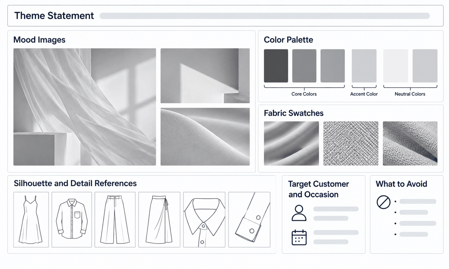
A clothes design maker starts most projects the same way: with a mood board. Before sketching, before choosing fabric, a designer gathers images, colors, textures and ideas that capture what a garment or collection should feel like. Done well, the mood board becomes the reference every later decision is checked against. Done badly, it is a collage of attractive pictures that inspires nobody to decide anything.
The difference is purpose. A useful mood board is built to guide decisions: it narrows the direction, sets a palette, suggests fabrics and silhouettes and makes it clear what does not belong. It is shared, so everyone working on the project, from designers to merchandisers to the people producing imagery, sees the same direction. And it is edited, because a board with too many ideas guides nothing.
This article explains what a mood board is for, what to put on it, how to edit it, how to handle physical and digital boards and image rights and how to use a mood board with a clothes design maker through development.
| Element | What it communicates | Common mistake |
|---|---|---|
| Theme statement | The idea in a sentence | Leaving the theme implied, so each person reads it differently |
| Mood images | Atmosphere, place, attitude | Too many images pulling in different directions |
| Color palette | Core, accent and neutral colors | Colors chosen from screens without physical references |
| Fabric swatches | Surfaces, weights and hand | Only images of fabric, no real swatches |
| Silhouette references | Shapes and proportions | References that are specific products to copy |
| Detail references | Collars, pockets, trims, finishes | Details from too many design languages |
| Customer and occasion | Who it is for and when they wear it | Designing for no one in particular |
| Exclusions | What does not belong | Never stating what is out |
What a Mood Board Is For
A mood board does three jobs. It sets a direction, by gathering the visual ideas that define the project in one place. It creates a shared reference, so a designer, a merchandiser and a photographer can all look at the same board and understand the same intent. And it gives the team something to check against later: when a sketch or a sample drifts, the board shows where it has drifted from.
It is not a design. The board suggests colors, textures, shapes and moods; the designs come later, drawn with the board in view. Many teams keep the board visible through development, on a wall or a shared screen, precisely because it keeps decisions consistent over weeks of work.
It is also not a collection of everything the designer likes. A board that tries to include every good idea ends up pointing in several directions at once, and the designs that follow scatter the same way. The strongest boards are selective.
Scope matters too. One board usually serves one collection or one clearly defined group of styles. A single board stretched across several unrelated projects loses its focus, while a separate board for each keeps every project's direction clear. Where collections are related, a shared palette or fabric story can link their boards without merging them.
What to Put on It
A mood board that guides decisions usually includes several kinds of material.
-
A theme statement. One or two sentences that name the idea, such as "workwear from a coastal town, softened for city life." Words stop people reading the images differently.
-
Mood images. Photographs of places, light, objects or scenes that capture the atmosphere. They set the feeling, not the garments.
-
A color palette. A small set of colors with a clear hierarchy: a few core colors, one or two accents and neutrals. Pair screen colors with physical references, since screen color is not a physical reference.
-
Fabric swatches. Real pieces of fabric where possible, so the team can feel weight and hand, alongside images of surfaces and textures.
-
Silhouette references. Shapes and proportions that fit the theme, drawn from archives, sketches or general references.
-
Detail references. Collars, pockets, closures, trims and finishes that belong to the theme's design language.
-
Customer and occasion. A note on who the collection is for and when they wear it, described in terms of lifestyle and needs.
-
Exclusions. A short list of what does not belong, which is often as useful as what does.
Editing the Board
Gathering is easy; editing is where a mood board becomes useful.
Start by removing anything that contradicts the theme. If the theme is soft and relaxed, a sharply tailored reference pulls against it, however good it looks. Then remove duplicates: three images saying the same thing weaken the board rather than strengthen it. Aim for fewer, stronger images, each earning its place by saying something the others do not.
Give the board a hierarchy. Place the images that most define the direction where they are seen first, and supporting images around them. A viewer should be able to tell within seconds what the board is about.
Check the palette and the fabrics together. A color that works on a screen may not exist in the fabrics the collection can use, and a fabric that suits the mood may not come in the palette's colors. Resolving that early saves time in development.
Finally, test the board with someone who was not involved in making it. Ask them to describe the direction in a sentence. If their description matches the theme statement, the board works. If it does not, it needs more editing. The most common fix is removing images rather than adding them, because an unclear board usually has too many ideas rather than too few.
Physical and Digital Boards, and Image Rights
Boards can be physical, pinned on a wall with real swatches, or digital, assembled in a shared file or tool. Many teams use both: a physical board in the studio for fabrics and color references, and a digital version that can be shared with colleagues, suppliers and image producers in other places.
Physical boards are hard to beat for fabric and color, because weight, hand and true color cannot be judged on a screen. Digital boards are easier to share, update and keep as a record. Whatever the format, keep the board dated and versioned, so changes in direction are visible.
Images gathered for a mood board usually come from many sources, and their use deserves care. A board used internally for inspiration is different from one shown publicly or used in marketing, and published images may be subject to rights that limit reuse. More importantly for design, references to other brands' specific products should be treated as general direction, such as a length, a type of collar or a mood, not as designs to reproduce. Questions about image rights belong with whoever handles the brand's legal matters.
Using a Mood Board With a Clothes Design Maker
The board guides every stage that follows. Sketches are drawn with it in view. Fabrics and colors are chosen from its palette and swatches. Realistic previews of the designs can then be set beside the board, which makes it easy to see whether the collection is still on direction or has drifted. Previews show appearance, so fabric behavior, color and fit are still confirmed on swatches, lab dips and samples.
The board is also useful beyond design. When a collection moves into product and campaign imagery, the same board tells photographers, stylists and anyone producing generated images what the collection should feel like: the light, the settings, the palette and the attitude. Sharing it with image producers early keeps the images consistent with the product, and it gives reviewers a clear reference when judging whether an image fits the collection.
In Lightchain AI (apparel AI), mood board work connects to trend references and early previews.
-
Trend references covering color, fabric, detail and style directions provide material to explore when building a board; they suggest directions rather than predict what will sell.
-
Sketches drawn from the board can become realistic previews, as described on the Ideas to Reality page, and be compared with the board side by side.
-
AI Virtual Try-On places the collection's designs on the same model, so the range can be checked against the board as a set.
For design teams looking for starting references for a new board, Stay Ahead of Trends is the Lightchain AI solution built for that starting point.
Frequently Asked Questions
Why does a clothes design maker start with a mood board?
Because a mood board sets the direction, creates a shared reference for the team and gives later decisions something to be checked against. It turns a feeling into a set of colors, fabrics, shapes and details.
What should a mood board include?
A theme statement, mood images, a color palette, fabric swatches, silhouette and detail references, a note on the customer and occasion and a short list of exclusions. Each element answers a different question the design team will face.
How many images should a mood board have?
Enough to define the direction and no more. Fewer, stronger images guide decisions better than many images pulling in different directions.
Should a mood board be physical or digital?
Often both: a physical board for real swatches and color references, and a digital version for sharing and keeping a record. Physical references are needed for true color and fabric hand.
Can other brands' products be used on a mood board?
As general direction for internal inspiration, such as a length or a type of collar. They should not be treated as designs to reproduce, and questions about image rights belong with whoever handles legal matters.
How is a mood board used after it is made?
It stays in view through development. Sketches, fabrics, colors and previews are checked against it to keep the collection on direction.
Which Lightchain AI solution helps build a mood board?
Stay Ahead of Trends is the one to use for starting references, with trend directions for color, fabric, detail and style. Previews through Ideas to Reality and AI Virtual Try-On then let the team check designs against the board.
In Closing
A clothes design maker uses a mood board to turn a feeling into a direction. Build it with a theme statement, mood images, a palette with a clear hierarchy, real fabric swatches, silhouette and detail references, a note on the customer and a list of exclusions. Edit it hard, test it on someone new, keep it dated and treat other brands' products as direction rather than designs. Then keep it in view, and check every sketch, fabric and preview against it.
Start Here
If your team is starting a new board and wants references to explore, Stay Ahead of Trends is the solution to use. It gathers trend directions for color, fabric, detail and style as starting material, and previews can later show designs beside the finished board. Start with one theme statement, gather references against it, and edit the board until someone new to the project can describe it accurately in a single sentence.
**Explore Stay Ahead of Trends → **https://www.lightchainai.com/global/solutions/stayAheadTrends