
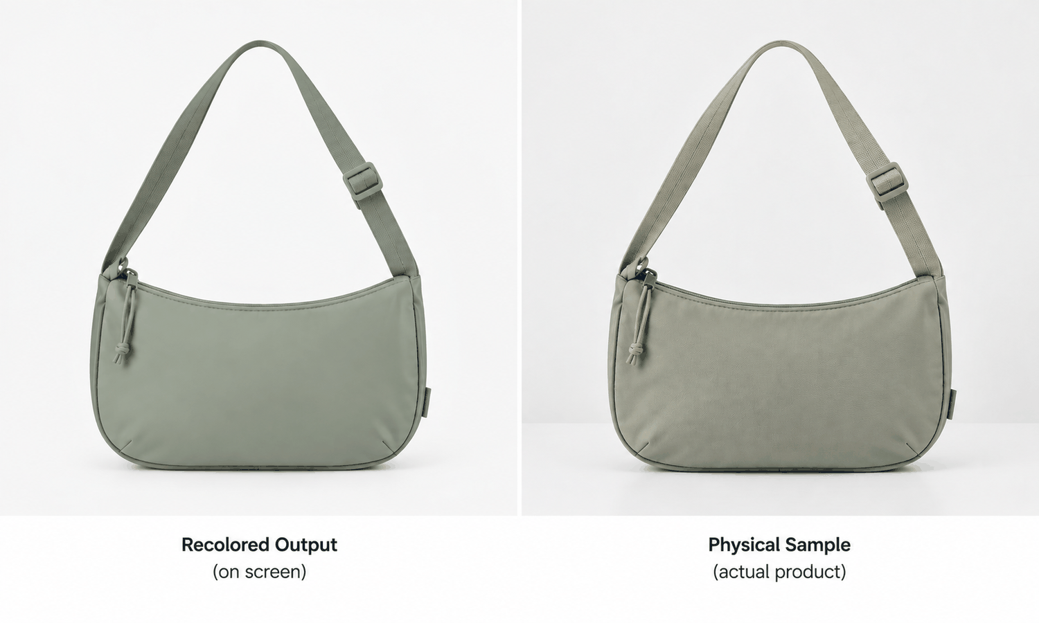
A sample room is where color stops being an idea and becomes a physical fact. Everyone upstream works with references, swatches and screen approximations; the sample room is the first place a color exists on the actual fabric, in the actual construction, under a light someone can point at.
That position makes the sample room the natural authority on color, and it is also why generated color imagery creates friction here specifically. A color that has been approved on a screen arrives at the sample room already carrying an expectation, and the physical result has to argue with it.
Fixing that before the next drop is mostly a matter of sequence and vocabulary rather than technology.
The screen approval is not an approval
State the hierarchy first, because everything else follows from it. A recolored image shows an approximation of a color on a display that has not been characterized, viewed under lighting nobody controlled. A strike-off shows the color on the actual substrate.
The two are not competing sources of truth. One is an illustration and the other is the reference, and treating the first as provisional approval creates a conversation the sample room has to have repeatedly.
Where a screen-approved color reaches the sample room as a settled decision, the room is placed in the position of contradicting a decision rather than supplying information. That is a process failure rather than a color failure, and it costs goodwill in both directions.
The cost compounds over a season. A room that has had to overturn three screen approvals starts hedging its language, which makes its findings less useful to everyone, and the people upstream start treating its input as obstruction. Neither reaction is unreasonable and both come from a sequencing error nobody made deliberately.
What a recolor actually changes, and what it does not
| Aspect | What the image shows | What the physical sample decides |
|---|---|---|
| Hue and general tone | A plausible rendering | The dyed or printed result |
| How color reads on the fabric surface | An approximation from the source | Interaction of dye, weave and finish |
| Depth in shadowed areas | Inherited from the original photograph | How the material actually behaves |
| Consistency across components | Applied uniformly | Shell, lining and trim taking dye differently |
| Metamerism | Not represented at all | Behavior under different light sources |
The last two rows produce most of the surprises. A shell and a trim that render identically on screen can dye to visibly different values, and a color that matches under one light source can separate under another — neither of which any image addresses.
Sample rooms know this. The value of writing it down is that everyone upstream does not, and the room is rarely in the room when a colorway gets approved.
There is a practical version of that observation. Circulating a short note on what a recolor does and does not represent, once, to the people who approve colorways, does more than any number of corrections issued after the fact. It is also better received before a dispute than during one.
Fix one: name the color from the standard, not the image
The cheapest correction available. Colors circulating in a drop should be named by their standard reference, and imagery should be described as showing that reference rather than defining it.
An image labeled with a color name and no reference invites everyone downstream to treat the pixels as the specification. An image labeled as an illustration of a named standard does not, and the labeling costs one field.
This also fixes a quieter problem. When a color is only known by its appearance in an asset, two people can be discussing different colors while looking at the same word. Season names make this worse rather than better, since a name coined for a range tells nobody which standard it resolves to once the asset has been separated from the deck it was introduced in.
Fix two: put the strike-off date on the drop calendar
Recolored imagery removes the wait that used to force sequencing. A colorway can be visualized long before any dye has touched fabric, which is useful and removes a natural checkpoint.
Restore the checkpoint deliberately. Put the strike-off approval date on the same calendar that carries the asset deadlines, and mark which assets are provisional until it passes. Most teams track both and in separate places, which is how imagery for an unapproved color reaches a buyer.
Marking provisional assets matters as much as the date. An asset with no status travels as though it were final, and the person who forwards it two weeks later has no way to know it was waiting on anything.
Where a strike-off subsequently shifts the color, regenerating the affected assets from the approved base is usually faster than reshooting — applying the new color to the existing design — see Design with Purpose.
Fix three: separate components before anyone approves anything
A garment is rarely one color even when it is described as one. Shell, lining, thread, tape, zip and label all take color differently. A recolor does not have to be applied to the whole garment at once — a single component can be rebuilt against a reference, so a shell can be recolored while the trim and label are held. Asking which parts change is still the question to settle early, because the image will only match the physical result where the intended treatment of each component has been stated.
Ask for component-level confirmation early. Which parts change, which hold, and which are approved against a different standard. That question takes a minute to ask at the point a colorway is proposed and saves a round at the sample stage.
It also protects the sample room from a specific accusation. When a delivered sample has a trim that does not match the imagery, the room is usually blamed for the discrepancy, when nobody upstream had specified that the trim was supposed to change at all.
Asking the question in writing is what converts that from an argument into a record. A colorway proposal that names its components has answered the question before it becomes contentious, and the answer sits somewhere both sides can find it.
Fix four follows from the same reasoning and is even cheaper. Sample rooms are frequently sent the recolored asset and not the original, which is backwards for their purpose. The original photograph shows the fabric as it actually is, with its real surface behavior, and that is the more useful reference for judging whether a strike-off is close; the recolored version shows an intent, which is context rather than a comparison target. Send both, labeled, and a technician stops comparing a physical swatch against a rendering.
What none of this fixes
Process improvements do not change what the medium can do.
Screen color is not a physical reference, and no workflow makes it one. Pantone accuracy is not something an image can guarantee, and differences between screen appearance and dyed fabric persist regardless of how carefully the imagery is produced.
The output is a visual asset in the broader sense too. It does not predict fit, determine sizing, model how a fabric behaves in motion, or forecast returns. A colorway that looks correct in an image has told you about intent and nothing about outcome.
Where the imagery genuinely helps the room
Worth ending on the positive case, because the corrections above are all constraints.
Recolored imagery is good at narrowing options before anyone commits dye. Twelve candidate colorways reduced to three on screen means nine strike-offs that never needed producing — and those twelve candidates can be queued in one run rather than produced one at a time, so the narrowing itself costs an afternoon, not a week, and that saving lands directly in the sample room's workload and lead time. It is worth claiming that saving explicitly when the room is asked whether this technology has helped, because it is real and it is invisible in any record of work that was never requested.
It is also useful for communicating intent across distance. A supplier receiving an illustration of the intended direction, alongside a physical standard, has more to work with than a standard alone, particularly where the intent concerns how a color should read on that specific garment rather than in isolation. The on-model versions of those assets come from the same approved base — see AI Virtual Try-On.
Questions sample room teams ask
Can a colorway be approved from a recolored image? No. Screen color is not a physical reference, and approval belongs to a strike-off against an agreed standard. The image narrows the field and does not settle it.
Why do shell and trim match on screen and not in the sample? Because a recolor applies uniformly while dye does not. Different substrates take color differently, and component-level specification is what closes that gap.
What should we ask for when a colorway is proposed? Which components change, which hold, and against which standard each is judged. One minute at proposal stage, one fewer round at sample stage.
Should we receive the original photograph as well? Yes, and it is often more useful than the recolor. The original shows the real fabric surface, which is the better comparison when judging a strike-off.
Does metamerism show up in generated imagery? No. Behavior under different light sources is not represented at all, and it remains a physical assessment made under controlled lighting.
Where does recolored imagery help us most? Reducing the number of strike-offs that need producing. Narrowing twelve candidates to three on screen is real saved work, and it lands in the sample room.
What to fix before the next drop
Four things, none of them technical. Name colors from the standard rather than from the asset, put the strike-off date on the same calendar as the asset deadlines, ask which components change before anyone approves anything, and send the room the original photograph alongside the recolor. Those four remove the situations where the sample room is asked to contradict a decision instead of informing one. The imagery keeps its genuine value — fewer strike-offs, clearer intent — and stops arriving as a verdict the physical result has to argue with.
Add the strike-off date beside the asset deadline this week.
**Put both on one calendar and mark which assets are provisional until the strike-off passes. Then add one line to your colorway proposal template asking which components change and against which standard. Two changes, no new tools, and they remove most of the color disputes that reach the sample room. → **Design with Purpose