
An image reads as fake long before anyone can say why. Somebody scrolls past, feels something is off, and moves on — and no part of that reaction involves noticing a specific flaw.
**Understanding what triggers it changes how you review. The eye is not detecting imperfection; it is detecting disagreement. Elements that should be consistent with each other are not, and the mismatch registers as wrongness even when every individual element looks fine on its own. Almost all of the mistakes below are agreement failures rather than quality failures, **which is why polishing the whole image does not fix them. Rebuilding the region that disagrees does.
Fake is a mismatch signal, not a quality signal
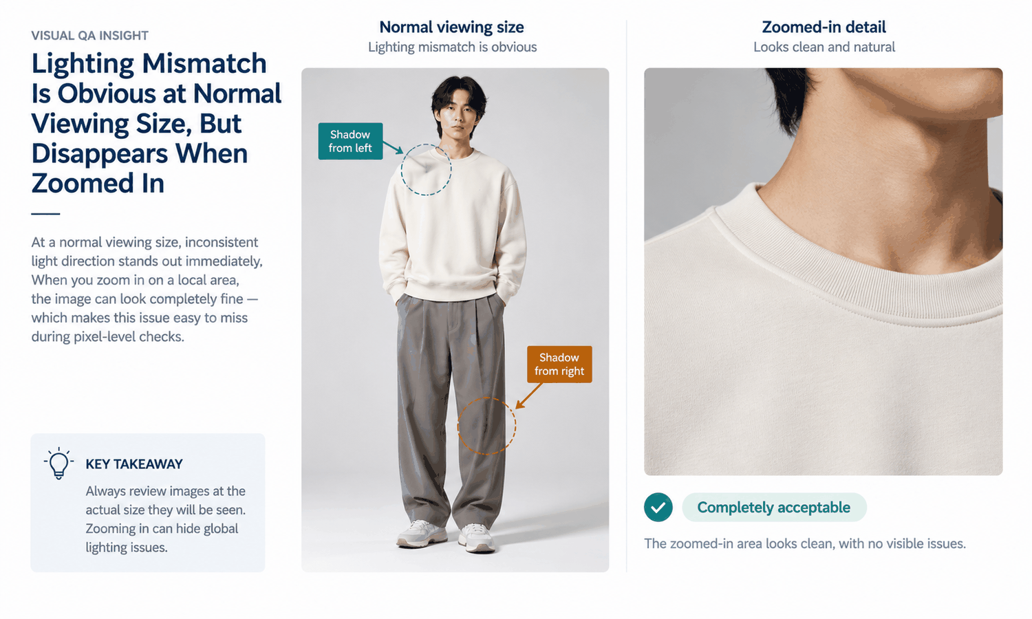
A slightly soft image looks like a slightly soft image. An image where the garment is lit from the left and the model is lit from the right looks fake, even at high resolution and even when both halves are individually excellent.
This has a practical consequence for review. Zooming in to inspect quality is the wrong instinct, because mismatch is most visible at a normal viewing distance and often disappears under magnification. The reviewer who steps back catches more than the one who leans in.
It also explains why teams sometimes chase quality improvements that change nothing. If the problem is disagreement between two elements, a sharper version of one of them makes the disagreement clearer rather than smaller.
Mistakes one to three: the physical ones
Light direction that does not agree. The most common and most detectable. The garment carries the lighting of the photograph it came from, and the model carries the lighting of theirs. Matching source photographs by lighting direction before generating is far cheaper than correcting the result afterwards; where one region still disagrees, a targeted rebuild of that region is the fix, not a re-run of the whole asset.
No contact shadow. Where a garment meets a body, and where a body meets a ground plane, real light produces a subtle darkening. Its absence makes objects appear to float, and floating is one of the strongest fake signals there is. Check the hem, the cuffs, and any place the garment sits against another surface. It is also a region-level fix rather than a reason to reject the asset — though avoiding it by matching sources costs nothing.
Perspective that does not agree. A garment photographed straight-on placed onto a model shot from slightly above will not sit correctly, and the mismatch shows most at the shoulders and the hem. This one is often invisible in isolation and obvious once you look for a horizon line in both sources. Angle and scene are settings rather than fixed outcomes, so this is usually a matching decision made before generating.
These three account for the majority of images that get described as looking wrong without further explanation.
They also share a useful property: all three are decided before generation. Sorting source photographs by lighting direction, camera height, and background simplicity takes an afternoon once and removes most of this category before it can happen. It is unglamorous preparation, and it costs a fraction of correcting the same failures one asset at a time.
Mistakes four and five: scale and edges
| Mistake | What it looks like | The fix |
|---|---|---|
| Print or texture at the wrong physical scale | A weave or pattern that reads too large or too fine for the garment | Compare against a known reference on the same body |
| Edges that are too clean | A garment outline with no softness, reading as pasted | Check the outline against a photographed reference at the same size |
Scale errors are strange because each element is correct in isolation. A print rendered beautifully at the wrong size looks synthetic in a way that is hard to name, since the viewer knows what a stripe of that width should look like on a body without being able to articulate it.
Edge perfection is the opposite problem to what people expect. Real photographs have slightly imperfect boundaries — a stray fiber, a hair crossing a shoulder, the softness of a lens. An outline with none of that reads as a cutout, and the impulse to clean up the edges further makes it worse.
Mistake six: the set that gives itself away
This one is invisible in any single image and unmistakable across a page.
The same model, in the same pose, in the same light, wearing forty different garments, reads as synthetic even when each image would pass on its own. A customer scrolling a category page is not evaluating one asset; they are receiving a pattern, and the pattern says these were not photographed.
Consistency is a genuine strength of this method and it becomes a liability at the point where it turns into uniformity. Pose, model, body type, size, scene and angle are all controls rather than fixed properties, so a range can be varied without losing the garment's identity — accept slightly less matching in exchange for looking like a set of photographs rather than a set of renders. Changing body type or size changes how the garment is shown, not how it fits. See Scale E-commerce for how that balance plays out across a catalog.
Judging this requires looking at the page rather than the file. A team reviewing assets one at a time in a folder will never encounter the effect, because the effect only exists in aggregate. Build a habit of viewing a category page mock-up before a range goes live, which takes minutes and is the only place this particular mistake is visible. Assembling the set on one canvas and editing at the layer level turns that pass into a review step rather than a separate exercise.
Mistake seven: polishing the wrong thing
The last mistake is a process one, and it wastes more time than the other six combined.
A reviewer who finds an image unconvincing typically responds by improving detail — regenerating for a sharper weave, retouching a seam, raising the resolution. If the underlying issue is light direction or a missing contact shadow, none of that helps: the effort has been spent on the part that was already fine, while the part that was wrong is still wrong. Sharpening the whole image is not the same as rebuilding the region that disagrees.
Diagnose before fixing. The question is always which two elements disagree, not which element is imperfect, and the answer takes about ten seconds once you are asking it.
The habit is worth building deliberately because the wrong instinct is the natural one. Detail is what a reviewer can see and name; agreement is what they feel. Asking the diagnostic question converts a feeling into something specific, and specific problems get solved while feelings get argued about.
A ninety-second mismatch check
Run these four passes at normal viewing size, in this order, and stop as soon as you find a disagreement.
-
Look at shadow direction on the garment and on the model, and confirm they point the same way.
-
Look at the hem, the cuffs, and the ground contact for the small darkening that says the object is really there.
-
Look at the shoulders and the hem for a perspective that does not match the rest of the body.
-
Step back and view the asset beside three others from the same batch, to catch what only appears as a set.
Ninety seconds, four looks, no zooming. Stopping at the first disagreement matters as much as the order: once one mismatch is found, the asset needs regenerating or rejecting anyway, and continuing the inspection only produces a longer list of things that were never going to be fixed individually.
The AI Virtual Try-On module in Lightchain AI (apparel AI) produces the on-model output from an approved source, and this is the check to run on it — the four passes catch what another generation would not — see AI Virtual Try-On.
What checking cannot fix
Some things are outside the reach of any review, and they are worth separating from the seven above.
Where the source photograph never recorded a detail, the output generated it, and no amount of checking turns a construction into a record. Upscaling and a local rebuild make the region cleaner; they do not turn a generated mark into a photographed one. Logos, printed text and small hardware need direct comparison against the source every time, because reconstructed text is frequently almost right — which is worse than obviously wrong, since obviously wrong gets caught.
The larger boundary sits underneath all of it. The output is a visual asset. It does not predict fit, determine sizing, model how a fabric behaves in motion, or forecast returns. An image that passes every check above is a convincing picture, not evidence about the garment, and those come from measurements, a graded pattern, a physical sample and your own data.
Questions apparel teams ask
Why does an image look wrong when nothing specific is visible? Because the eye detects disagreement between elements rather than imperfection in one. Light direction, perspective and contact shadows are the usual causes, and each looks fine in isolation.
Should we review at high magnification? No, and this is the most common review mistake. Mismatch is most visible at normal viewing distance and often vanishes when magnified, so a reviewer leaning in is looking in the wrong place.
How do we avoid the uniform-set problem? Vary pose across a range and accept marginally less matching. A page of identical poses reads as synthetic even when every individual image is convincing.
Is it worth matching the lighting of source photographs? Yes, and it is the cheapest single improvement available. Grouping sources by lighting direction before generating removes an entire category of failure for the cost of an afternoon, against correcting the same failures one asset at a time.
What about the too-clean edges problem? Resist the urge to tidy them further. Real photographic boundaries carry slight imperfection, and an outline with none of it reads as pasted regardless of how precise it is.
Who should run the check? Someone who did not produce the asset, at the size it will be seen. Familiarity with an image makes its mismatches harder to notice, which is a well-known effect and not a comment on anyone's ability.
What separates convincing from almost
Agreement, not polish. Light that points the same way, a shadow where the garment touches the body, perspective that matches, print at a believable size, an outline with some softness in it, and a set that does not repeat itself. Six checks and one habit — diagnose the disagreement before improving anything. Teams that review this way spend less time and reject fewer assets, and the images stop attracting the reaction that nobody can explain.
Run the four-pass check on ten recent assets today.
**View them at normal size, look at shadow direction, contact shadows, shoulder and hem perspective, and then at the batch as a group. Note which of the seven appears most often in your own output rather than fixing them one by one. That single count tells you whether the change belongs in how you shoot sources, how you pair them, or only in how you review. → **AI virtual try-on
About the author
[REPLACE — real person's name, role, relevant experience, LinkedIn URL. No team byline.]