
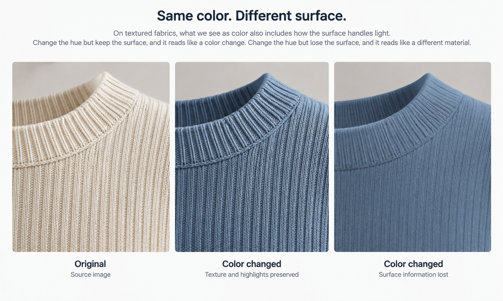
Somebody looking for an app to change clothes color is usually thinking about one operation. There are three, they behave differently, and treating them as one is what makes results unpredictable.
Changing the color of a flat, uniform surface is close to a straightforward substitution. Changing the color of a surface that carries texture, sheen, or weave is not, because on that kind of cloth the color and the material read are entangled. And changing the color of something with a print or several colors in it is not a color change at all; it is a redesign, and it needs to be treated as one.
Practices that hold up start with naming which of the three you are about to do.
Three operations that get called one thing
| The operation | What it actually is | What to review |
|---|---|---|
| Recoloring a flat, uniform surface | Close to a substitution. Smooth wovens and flat jerseys sit here | The hue, and whether the details survived. This is the straightforward case |
| Recoloring a surface with texture, sheen, or weave | Not a substitution. Color and material read are entangled on this kind of cloth | The surface before the hue: pile direction, rib highlight, where the sheen falls |
| Recoloring something with a print or several colors | A redesign. The print has internal relationships and changing them is a design choice | Whether the result is the colorway somebody specified, rather than a plausible one |
The middle row is where most disappointment lives, because it looks like the first row until you look closely. A flat recolor of a textured fabric can come back with the color right and the surface flattened, which reads to anybody who knows the product as a different cloth rather than a different color.
The bottom row causes a different problem: it produces something plausible that nobody specified. A multi-color print recolored as a whole is a new colorway of that print, and somebody has to decide whether it is the colorway they wanted.
When the surface carries information, color and material are entangled
On a smooth poplin, color sits on the surface and can be swapped without disturbing much else. On a brushed wool, a rib knit, a corduroy, or a satin, what you read as color is partly the way the surface handles light, and a recolor that does not preserve that reads as a substitution of the fabric.
The practice that helps is to look at the texture rather than at the color when reviewing. Ask whether the pile still shows direction, whether the rib still catches light along its length, whether the sheen still falls where it did. Those questions are answerable in a few seconds and they are not the ones people ask, because the eye goes to the hue.
The second practice is to keep the neutral capture. Every derived color comes from the source, so a source captured in one season's colorway carries that colorway's surface behavior into everything derived from it. Deciding colorway and fabric direction from a neutral, complete capture is what makes the derived versions comparable to each other rather than to whichever version happened to be photographed.
A print is a design, not a color
Recoloring a print is a design operation and needs a design decision behind it. A three-color print has relationships in it: which color is ground, which carries the motif, which is the accent that makes it work at distance. Changing them proportionally is one choice among several, and it is rarely the choice a designer would have made.
So the practice is to specify the print recolor rather than request it. Say which element takes which color, and say it in the brief rather than choosing from what comes back, because choosing from outputs means the design was decided by whatever the run produced.
Placement matters here too. Where a motif sits relative to center front and the seams is a specification with a right answer, and it can drift on one colorway while the others hold. When that happens and the rest of the frame is sound, a targeted correction to that region is smaller than a rerun and keeps the set comparable, which matters because colorways are displayed together and an inconsistency between two of them is visible in a way it would not be alone.
The practices that hold up
None of these are sophisticated. They hold up because they are structural rather than because anybody clever thought of them.
-
Name which of the three operations this is, before running it, since the review question is different in each case
-
Capture neutral and complete, so every color derives from the same source rather than from one season's version
-
Review the surface before the hue, because the hue is what the eye checks anyway and the surface is what gets lost
-
Specify print recolors element by element in the brief, rather than selecting from outputs
-
Check each colorway against the source individually, since a defect on one has no reason to appear on the others
-
Record which colorways were shown and which were sampled, because those two lists diverge and the divergence is what a later dispute turns on
The detail check is the one that gets compressed when a colorway run is large. Logos, printed text, care labels, and small hardware get compared against the source image on every single on-model output, without exception, and a colorway set is precisely where sampling feels reasonable and is not. Reconstructed detail lands almost right — a letterform slightly off, a stitch count wrong, a zipper pull the wrong shape — and there is no mechanism by which colorway one being clean makes colorway four clean.
In Lightchain AI (apparel AI) the uploaded source stays beside every AI Virtual Try-On output derived from it, which is what keeps that per-colorway check quick rather than aspirational.
What no color pass produces
A pass produces images of colors. It does not produce colors.
Screen color is not a physical reference, exact code matching is not something to promise, and the gap between a monitor and a roll of cloth stays open regardless of display quality. Colorways get settled by strike-offs against an agreed standard, and values must never be read off a generated asset and sent to a mill or published as a product attribute. What a pass gives you is a shortlist worth sampling, which is a real and useful thing and a different claim from the one the images invite.
The rest of the boundary applies unchanged. The output is a visual asset. It does not predict fit, determine sizing, model how a fabric behaves in motion, or forecast returns. Those come from measurements, a graded pattern, a physical sample, and your own data. A recolor changes nothing about any of that, and a style shown in eight colors is no closer to a fit answer than the same style in one.
Two scope answers save time. Footwear is not covered by this class of workflow, and that is structural rather than a gap waiting to close. Lace and open work, sheer fabrics, complex prints, and heavily layered looks are documented weak spots, and a recolor in one of those categories inherits the category verdict rather than escaping it.
Where the practice breaks under pressure
Colorway work is where corners get cut, because the run feels like a repetition of something already approved.
Three things go first, in a predictable order. The per-colorway check becomes a sample of the set. The neutral capture gets skipped for a style that was already photographed in a colorway. And the print recolor gets chosen from outputs because specifying it properly would have taken a conversation with a designer who is busy.
Each of those is defensible in the moment and each one produces a specific, recognizable failure: a defect in one colorway that nobody caught, a set that does not match itself, and a print colorway nobody would have chosen. Knowing the order in advance is most of what protects against it, since it turns a decision made at speed into one somebody has already thought about.
Whether the work runs through Lightchain AI or a camera, and across a catalog of any size, those three are the ones to defend.
Frequently asked questions
How do I know if a fabric counts as textured for this?
Look at whether the surface changes how light behaves across it: pile, rib, satin, brushed finishes, and open weaves all do. If a photograph of the fabric looks different when you rotate it, the surface carries information and a recolor has to preserve that. Smooth wovens and flat jerseys generally do not.
Can we recolor a print at all?
Yes, and it should be specified element by element rather than requested as a whole. A print has internal relationships and changing them proportionally is one design choice among many. Treating it as a design task and briefing it that way is what separates a usable result from a plausible one.
Do all colorways need checking if the first one was clean?
Yes, individually. Each colorway is a separate output and there is no mechanism by which one being correct makes another correct. This is exactly the case where sampling feels most reasonable and covers least.
Can we approve a colorway from the screen if the client is happy?
No. A client being happy with a screen version is useful information about the direction and not an approval of a shade. Send it to strike-off and keep the screen version labeled as a shortlist until a physical reference comes back.
What if the source was shot in a colorway rather than neutral?
You can still derive from it, and the derived versions will carry some of the original colorway's surface behavior. For a small set this is often acceptable; across a season it produces a range that does not match itself. Reshoot neutral for the bodies that recur.
How many colorways should we show versus sample?
Those are different numbers and keeping them separate is the practice. Show what merchandising needs, sample what you might buy, and record both lists. The divergence between them is normal and only causes trouble when nobody wrote it down.
In closing
Reliable color work comes from naming which operation you are performing before you run it. A flat recolor is close to a substitution, a textured surface entangles color with material and needs the surface reviewed rather than the hue, and a print recolor is a design decision that belongs in a brief rather than in a selection from outputs. Around all three sits the same limit: a pass produces images of colors and never colors, and the shade is settled physically against a standard. The practices that hold up are the ones that survive a busy week, which is why knowing which three get cut first is worth as much as the list itself.
Start here
Take one style you have run in several colorways and sort those colorways by which of the three operations produced them. Then check whether the review that was applied matched the operation: was the surface looked at on the textured ones, was the print recolor specified or selected. Most teams find one category was reviewed as though it were another, and that mismatch is the practice worth fixing before the next run.
**Start with fabric and colorway work → **https://www.lightchainai.com/global/solutions/designWithPurpose